
Doom doesn’t require much introduction. One of the major popularizers of the FPS genre, Doom is mostly talked about for its incredible gameplay, introducing many things we take for granted in our FPS games now, along with its unique fast-paced hyper-aggressive gameplay. The gameplay, of course, is not what we’re here for, as good as it is. Doom is a long-running series with several iterations, each with a new art style that depicts its monsters totally differently. For this article, we’ll be looking at the recurring demons of Doom, and how they’ve changed over the years.
Imp
Skipping over the generic zombie enemies, we start with the most basic demon, the normal foot soldier of hell. Despite the name, which usually suggests a small demon more focused on trickery and magic than raw power, Doom’s imp is a beefy brute covered in spikes. The mushroom-shaped head is pretty amusing, as is that big gaping angry mouth. As simple as it is, the original imp is charmingly goofy, but all later entries would change it dramatically.
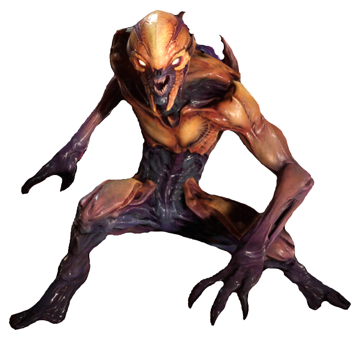
Doom 3 unfortunately came out in the “grey and brown shooters” era of video games, and leaned very heavily on the grey end of things. Doom 3’s imp doesn’t resemble the original at all. Slender and lacking in spikes, their defining feature is instead the array of eyeballs across their face, something more obvious in this picture, of the hell variant of the imp.
The hell imp also has a much nicer color pattern, with rough yellow and red skin across their body. It’s actually pretty striking in this form, certainly more than the base form.
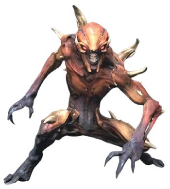
Doom 2016’s imps are entirely different again, hewing a little closer to Doom 3’s more slender, agile imps. The design does a good job of communicating their tendency to climb all over in order to throw fireballs from a distance, and I like the colors, but it’s still not quite as unique as the original. It doesn’t have a “charm point” to draw the eye. Thankfully, Eternal makes some changes.
Doom Eternal’s imp is far and away my favorite of the series, with the nice colors and agile posture of 2016’s imp and the spikes and goofy face of the original. It’s a fantastic compromise and gets back a lot of great personality that was lost in the more “threatening” versions.
Revenant
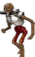
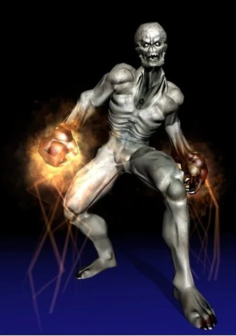
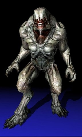
Introduced in Doom 2, revenants are hilarious cause they’re skeletons and skeletons are hilarious. Look at that little Skeletor face. Apparently, these aren’t human skeletons but the skeletons of dead demons turned into undead cyborgs to continue their war. It’s weird, given none of the demons in the game should have a skeleton that looked so human, but hey, it’s cool lore.
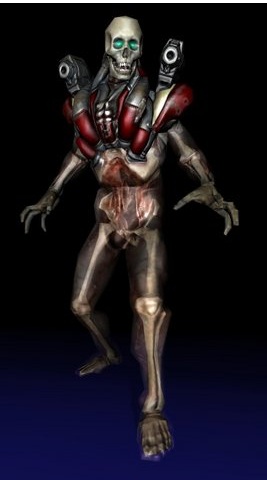
Doom 3’s revenant is just awesome, easily my favorite of the bunch. The muted color scheme actually works in the revenant’s favor, letting the dull red armor stand out on the more grey body. I love the transparent flesh. Skeletons are always cooler with a little something extra. The glow in their eyes, combined with their clearly unnatural height, actually makes them a little haunting.
 2016’s version isn’t as interesting, but I do love the withered, mummified flesh that clings so tightly to its limbs and skull. Those eyes are also lovely, completely blank voids. Kinda look like olives. I hate olives, so those are very threatening eyes. He might make me eat them.
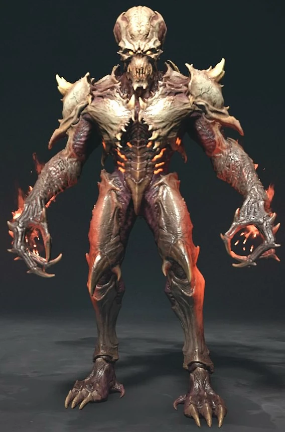
Eternal’s revenant is a little toned down, without much change. It’s a little more cartoonish, with those glowing yellow eyes. I prefer the shiny wet look of the revenants in 2016, but they’re overall pretty close.
Demon
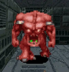
Yes, this one is just called a “demon” in the first game. It’s a pretty bad name given there’s a lot of enemies that are demons, which is probably why everybody calls them Pinkys instead. The pinky is a straightforward brute, muscle upon muscle. You really need to see them from the side to understand how weird they look.
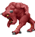
I love this goof’s weirdo anatomy. With those long legs and massive head, it really gets across that this guy spends most of his time running headfirst at things he doesn’t like. Which is everything.
Doom 3 officially renames the demon into the pinky, even though being Doom 3, it’s still mostly grey. However, it is really cool! I like the contrast between the super-fleshy front half and the robotic back half. Possibly my favorite feature is that “hood” of flesh that covers the top half of its face. That’s is just an awesome look. Apparently, that comes about because they are “born” with flesh covering their face and must chew their way out. Neat!
2016’s pinky changes again, taking on a shape closer to the original, but much less human. Now pinkys are covered in thick, chitinous armor that defends from from attacks from the front. Like the original, their design emphasizes a head-first charging tactic. Not my favorite, but I love how chunky they are!
Mancubus

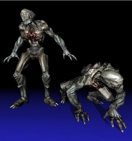
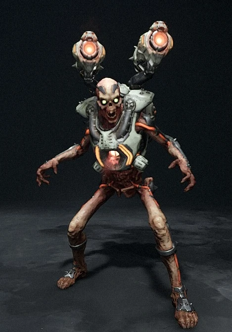
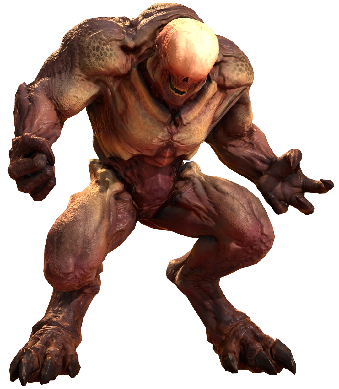
The mancubus was introduced in Doom 2, one of the many cyborg demons of the original games. It’s unclear if they have human ancestry, but they certainly look like it. Big pudgy ogres with big scary flamethrower arms. They’re okay, but a lot more is done with the concept later.
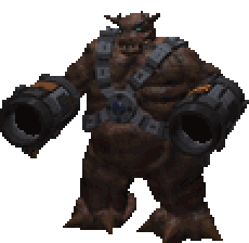
We’ve mostly been skipping Doom 64 because its demons mostly had the same designs as their originals. Its mancubus is one of the few with a new design, removing most of the human elements. Overall, I’m not a fan. The design is a lot more generic and a little clunky looking. The guns aren’t as well integrated as they are in other mancubi and the body just doesn’t look great.
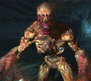
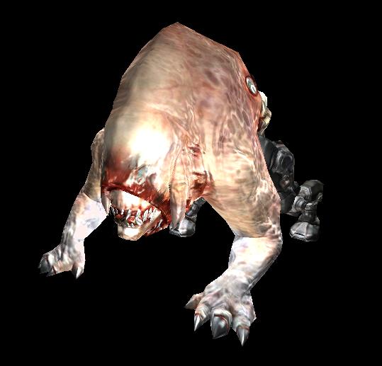
Ughhhhh, why does everything in Doom 3 have to be grey? It’s otherwise a pretty cool design, with a face that distinctly reminds me of an elephant seal. It’s the expression, really. Apparently the two tentacles on the side were originally meant to be tusks, but it all ends up looking like Man-thing, which is a win in my book. Its relationship to humans is unclear, but it has nipples, suggesting it may have been created from human bodies like many of the zombie type enemies. It also suggests that somebody has drawn porn of this version somewhere online if you dig enough for it.
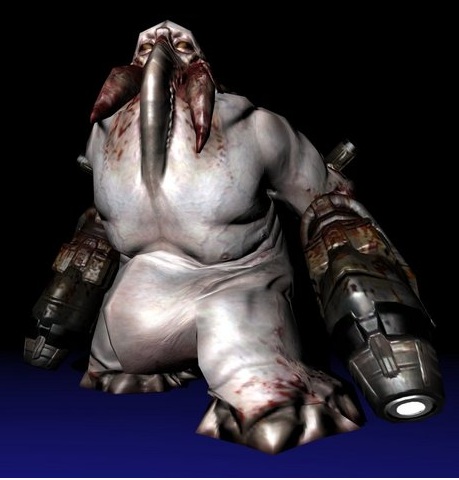
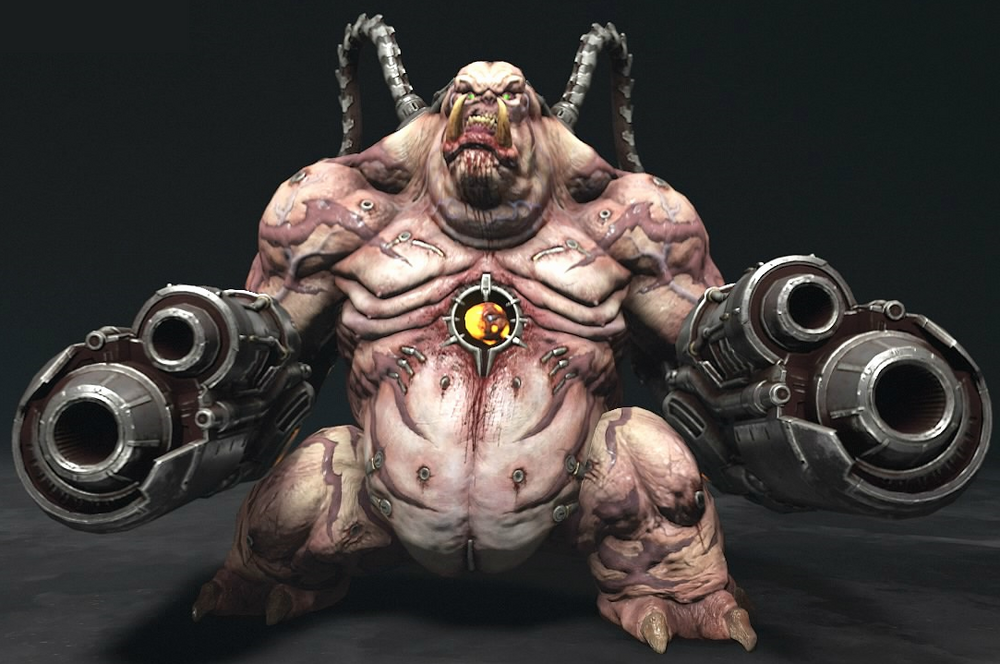
ADORABLE. There’s nothing more innocent than a cyclops, and that dopey open mouth just adds so much to it. This is by far my favorite Mancubus for how charming and cute it is. I also really adore that color scheme with the deep blue plates and pink flesh. A good fat buggy boy! Particularly charmingly, those guns are natural weapons, powered by the rotting matter they enjoy eating. They’re spraying you with burning decayed garbage. Fun!
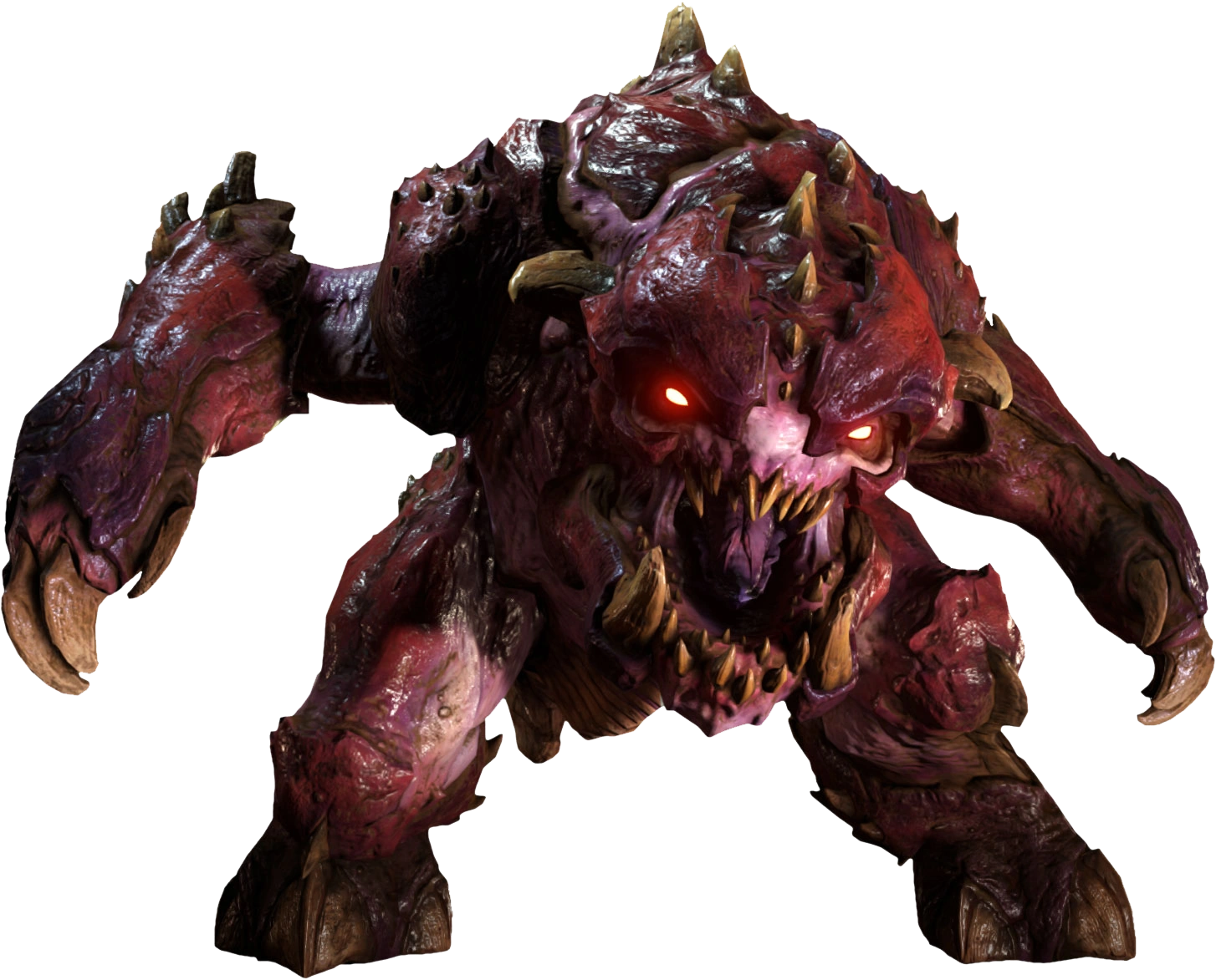
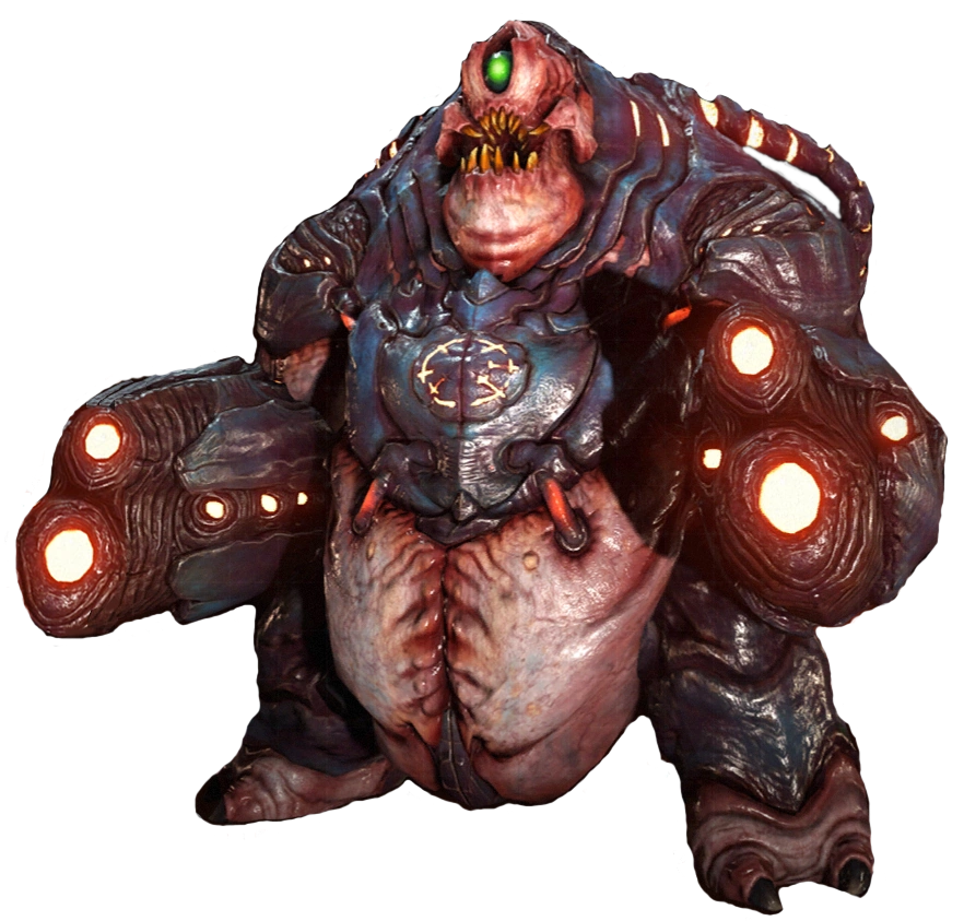
Eternal returns to a design closer to the original, more of a flabby ogre with tusks. I don’t love it, but if the original was your favorite, well, it’s back! I like the addition of the staples and plug in points across its body. But overall, it’s just a little too growly and dumb for me.
This one has 6 nipples.
Cacodemon
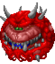
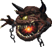
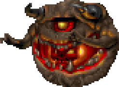
Probably the most iconic design in the original Doom, effectively the series mascot, the cacodemon is awesome! And also a ripoff, traced from D&D’s astral dreadnought. No, really.

The astral dreadnought’s head translated well to its own creature, and cacodemons have appeared in every mainline Doom game. It’s a classic for a reason. I love the simple color scheme and lumpy meatball shape. It’s simple and good. And of course, every cycloptic monster is good.
While you won’t see it in the game, the cacodemon did have a sprite for its back. Mostly what you’d expect, but what’s up with the holes? Kinda looks like the cacodemon is female. If so, what’s their male equivalent? Do they have one, or do they just reproduce by parthogenesis? Well most likely, these holes are just remnants from the clay models they made of the monster, made for the pegs they supported it on. I just like giving them a lore explanation.
Doom 64’s cacodemon is another one that changes pretty drastically. It basically changes entirely, losing its classic color palette, most of its spikes, and its texture, and gaining arms in exchange. Weird. I appreciate the effort, but it looks like a low-quality Pain Elemental (we’ll get to those next). While too many Doom 3 creatures were grey, too many of 64’s are brown.
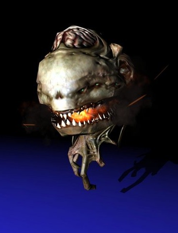
3’s cacodemon is even more divergent, and I love it. It looks like another monster formed from human parts in the most grotesque way. Look at that horrible hand under it like some sort of freaky fin. I love it. It’s even got an exposed brain! I especially love the smoke trailing from that incredibly oversized mouth. It’s like the worst blimp in the world. Add it to the Macy’s Thanksgiving Parade.
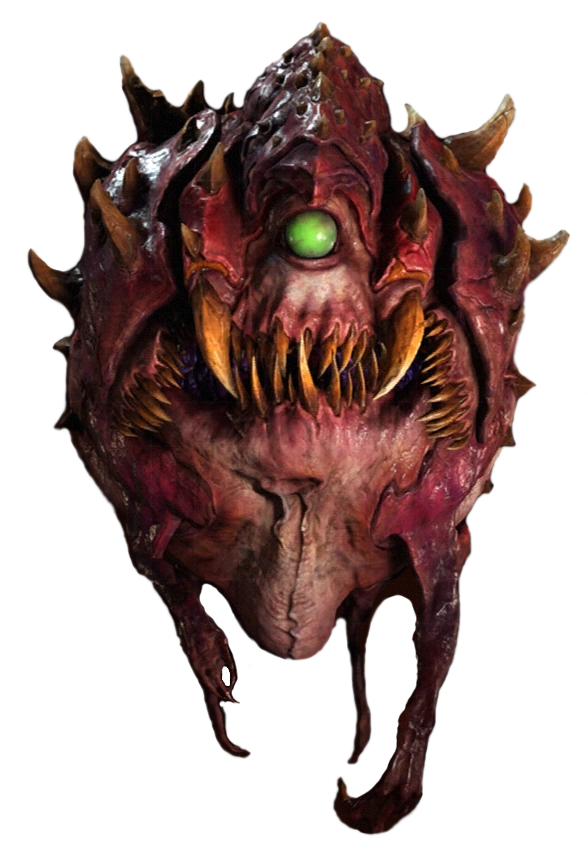
2016’s cacodemon looks a lot like the mancubus, with a similar mouth and eye. It’s not quite as cute, but it’s still a pretty delightful design. I love the malformed, vestigial limbs dangling from its bottom. Like 3’s cacodemon, they can open their mouth really absurdly wide for a hell of a bite. In multiplayer, it even gets an extending tongue it can use to grapple enemies and pull them into its mouth. It’s basically a cartoon frog! That flies!
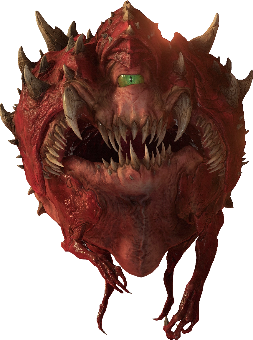
Eternal’s cacodemon is nearly identical, but slightly changed to more closely resemble the original in some ways. I don’t have much to say, but I do like its almost humanoid appearance. That’s so charmingly goofy!
Pain Elemental
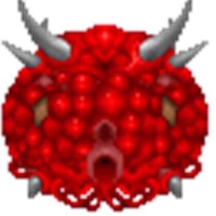
Probably my favorite name of any Doom monster, Pain Elementals are pretty much just cacodemons with arms, but they’re still pretty fun. I like the horns on that squat frog head and those reedy little arms. And of course, the skull we can see in its mouth! That’s a lost soul, an enemy we’re not gonna cover cause they’re honestly all just skulls. The Pain Elemental spits them out as projectiles. Symbiosis between enemies! I love it!
64’s Pain Elemental is entirely different, and really cool. Their arms have become mouths and they gained the deep purply red that so many of the demons would have in 2016. I don’t normally like monsters with two mouths much, but when they’re on your arms, that’s great! I don’t think it all comes together, however. Feels like it’s missing something.
Eternal’s version is a pretty straight translation of the original, just with a little more detail to the mouth. I like this big cartoony beast. They captured and exaggerated all the most important elements. Bigger horns, beefier arms, crazier mouth, and glowier eye. I don’t always like straightforward updates, but this is the best way to do it.
Arch-vile

The arch-vile is a pretty basic humanoid, but I like that bit of exposed spine. You think that’s like an exposed midriff for undead demons? Besides that, its head is kind of interesting. It looks like a Bionicle, really.
They’re particularly iconic for their rad pose where they catch themselves on fire and try to show you how big the fish they caught was.
Doom 3’s arch-vile is boring but he has glowing boxing gloves and that’s kinda funny I guess.
Eternal’s is also a little dull. The poor thing’s just too humanoid to ever impress me, and his proportions are even less impressive now. I do like the big space-invader skull he’s got, but if that’s what they were going for, I’d go even further.
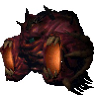
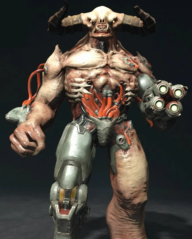
Baron of Hell
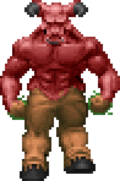
The biggest and toughest of Doom’s regular enemies, Barons of Hell aren’t particularly interesting in their initial appearance. They’re effectively the most standard possible demon, a big red guy with goat legs. It’s dull and a touch goofy.
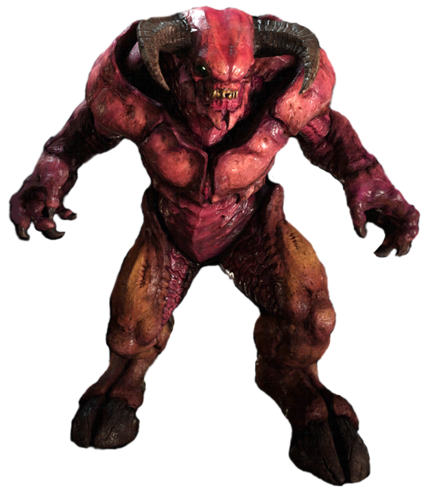
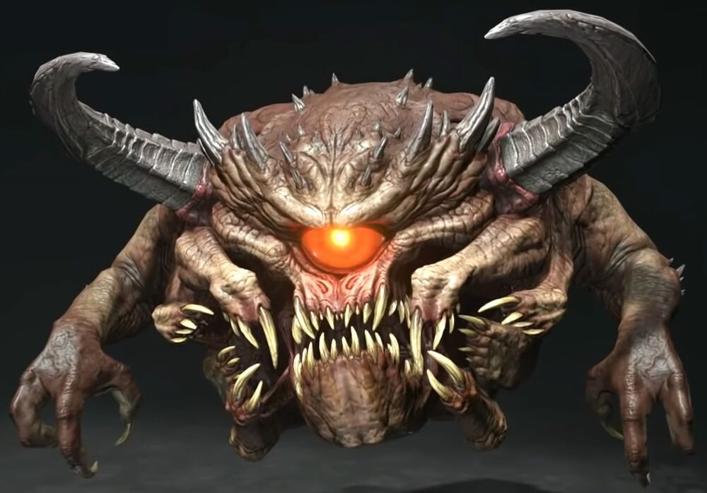
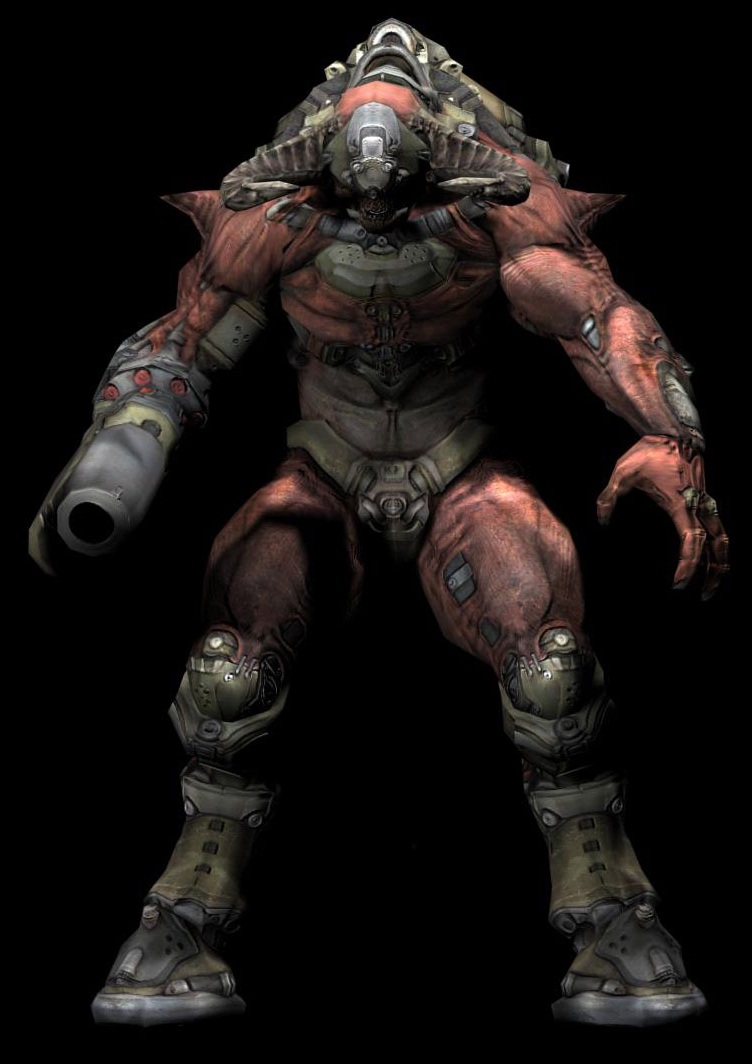
2016’s is a decently straightforward adaptation, but with some additions that make it one of the coolest “standard” demons I’ve ever seen, beating out losers like the Balor and Pit Fiend all day. The armor-like texture of the muscles is pretty awesome, and I like how the color transitions going into the legs and the scales on the inside of the thighs. About as cool as a balrog-type demon can get without getting weirder!
Hell Knight
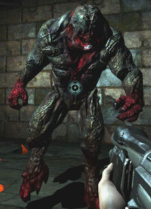
Speaking of getting weirder, in Doom 2, Hell Knights were simply a pallet swap of Barons of Hell, but Doom 3 made them into massive, eyeless abominations with heads like anvils. I love that head shape and the pattern of red around the mouth, especially the small holes fringes of flesh extending into the area covered in the tougher skin or bone of the head.
In hell, Hell Knights have darker skin with red hands and feet and red parts on their neck and head. I like this version a little more, with a rougher, rocky look to its skin and much nicer color pallet.
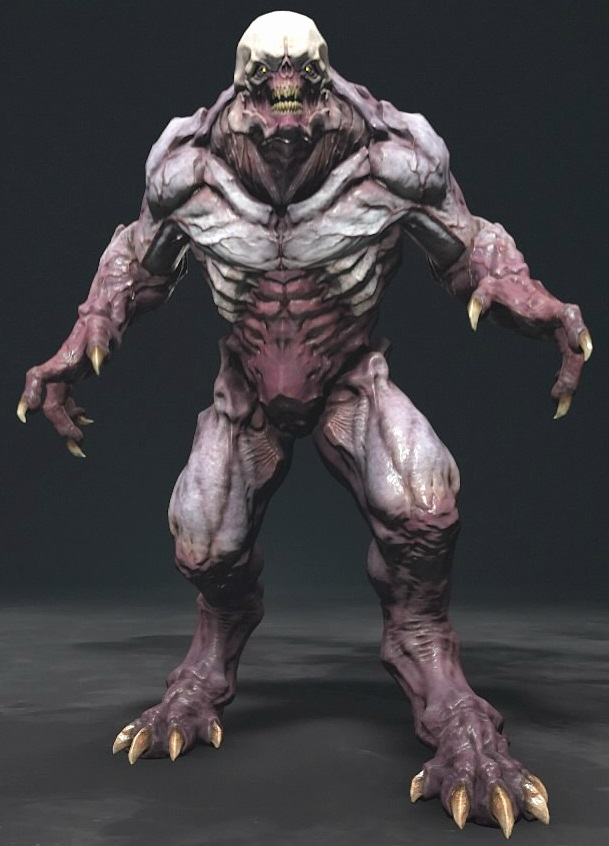
2016 expands on this design and excels with it, adding a beautiful green and purple color scheme, some lovely pebbly scales across the shoulders, and a more rounded face, giving it an awesome eyeless skull look. I love me an eyeless monster, and 2016’s hell knight is an especially cute one. It just looks innocent, in that way that a bear does. You don’t touch it, but it CAN be cuddly. My favorite version!
This one has eyes so I’m going to pretend it doesn’t exist.
Cyberdemon

The cyberdemon is probably the most famous monster of the games, and although it is more known for its boss fight than the quality of its design, I really do like it. In particular, I love its head. It’s got a hammerhead shark’s eye placement! I can’t believe they let it have something that goofy! It’s amazing! Look how cute it is!
I kinda hate the Doom 3 cyberdemon. It’s a bit of a mess, honestly, a hard to read mass of pink and green. I don’t particularly like how the helmet interacts with the head, or the rest of the cyborg parts for that matter. I appreciate what they were going for, and I do love parts. The spikes on the shoulders are really cool, looking like they’re covered in flesh.
And being fair to 3’s cyberdemon, I don’t like 2016’s much either. I feel like there’s no “hook” to the design that makes it stand out. Still, I do like the legs. They really have the feeling of a massive, sturdy animal and the armor on them is pretty cool. But there’s not enough cyber in this cyberdemon, especially in a game with other heavily technology-based enemies.
Eternal doesn’t call them cyberdemons, but its “Tyrant” enemy is essentially identical to the original cyberdemon. The good news is we have a lot of cyber back. That’s good. I want a lot of cyber in my cyberdemon. The exposed ribs and stomach full of tubes are in fact very cool. However, while the eyes are pretty widely spaced, they’re not as wide as they were in the original. That’s sad! That was my favorite bit! Why would you take my fun, Doom? It’s still very cartoonishly mean looking and I like that, but I want a hammerhead!
Spiderdemon
Our final demon, the spiderdemon or Spider Mastermind, my preferred name for it, was the final boss of the original Doom. This brain-gremlin is pretty hilarious. Its suit is kind of thrown together junk, without a lot of detail. It looks like tinker-toys. He probably made it himself. Look how proud he is.
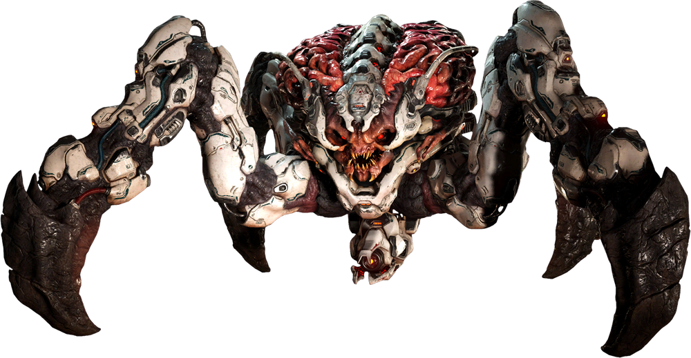
And this is why I wanted to end on 2016’s Spider Mastermind. I love everything about it. I love that tiny little angry face. I love those scrawny little T. rex arms. I love that giant brain split with the metal exoskeleton. I love that it has the colors and shapes of an action figure. It’s an absurdly charming interpretation, and one that doesn’t stray too far from the original for most purists.
I hope we keep getting Doom games and they keep making their monsters as wildly divergent between each one. In the meantime, we’re going to cover original monsters, those who only appeared in one or two games and never came back. See you then!
Like this article? Want more like it? Suggest other series in the comments and check out my other work!
The Article just like this but for Legend of Zelda’s Lizalfos
The Frogs of Dungeons and Dragons
Maybe Pain Elementals are the males to Cacodemon females? They’re both floating heads with one eye.
Only way to know is to leave them in a room together.